Reflection on lesson 6 (26 August 2015)
Today, teacher teach about colour theory, and before that, teacher wanted us refresh our memory on gestalt laws by analysis two Gestalt artwork.
-

- working on the poster
-

- first artwork that we need to analysis
-

- second artwork that need to analysis
After done analysis the artwork, teacher started to teach us about the colour theory, and from what teacher had teach us, I learned what is primary colour, secondary colour, tertiary colour and complimentary colour.
Primary colour
- Red, yellow and blue are the only primary colour
- primary colour is the colour that can’t be made by mixing other colour together
Secondary colour
- When we mix two primary colour together, we will get secondary colourRed + yellow + Blue = white
- red + yellow = orange

- red + blue = Magenta / purple

- Yellow + blue = green

Tertiary colour
- made by mixing a primary colour and secondary colour

- six tertiary colour (only can mix with the colour that near it)
- red + orange = red-orange
- red + magenta /purple = red-purple
- yellow + orange = yellow-orange
- yellow + green = yellow-green
- blue + green = blue-green
- blue + purple/magenta =blue-purple
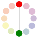
complimentary colour
- Colour that are opposite to it in the colour wheel, such as:
- complementary colour can help to create a special artwork, such as:


Analogous colour
- a group of 3 colour that each colour are beside or next to each other in the colour wheel
- the colour at the center/middle of 3 colour is called mother of colour, such as:

- the picture show three colour which is analogous colour, and the three colour are red, red-violet and violet.
- red-violet are the colour at the middle which is also the colour that connect red and violet, so red-violet are the mother of colour
After learned the colour theory, teacher gave us a test in order to make sure we learn something. and the picture below show the test that I did in class.


Refection on lesson 7 (27 August 2015)
Today we started. title of “Fairveiw got talent” and the Date and time which is to be confirm (TBC). In order to create the best poster, we need to draw 3 design on a A4 paper so we can choose the best one to improve and be the final design of our poster. And we will start to draw out design tomorrow.
Today teacher started class by giving us a test, all question was about the colour theory, and the purpose for that was to refresh our memories. After the test, we started did our assessment, the assessment was to create a poster for talent show, and in the poster we need to included the Gestalt Laws that we learned last week.
I start to draw out my design on a A4 paper after the test, however, when teacher look at my design teacher took my design away and said I should draw on a sketch paper instead of A4, so in order not to waste time, I open my laptop and did some research and get some idea on how should I draw my design.
Reference
- Alessandra Sulpy. “Analogous Colors: Definition & Examples.” Study.com. N.p., n.d. Web. 29 Aug. 2015. <http://study.com/academy/lesson/analogous-colors-definition-examples.html>.
-
“Analogous Color Schemes.” Color Wheel Artists. N.p., n.d. Web. 29 Aug. 2015. <http://color-wheel-artist.com/analogous-color.html>.
-
“Complementary Colors.” Worqx.com. N.p., n.d. Web. 29 Aug. 2015. <http://www.worqx.com/color/complements.htm>.
-
Nafie, Coral. “What Are Primary Colors?” About.com. N.p., 2015. Web. 29 Aug. 2015. <http://interiordec.about.com/cs/faqsoncolor/f/faq_primarycol.htm>.
